Case Study
Envato Enterprise Landing Page Redesign
Product Design
Context
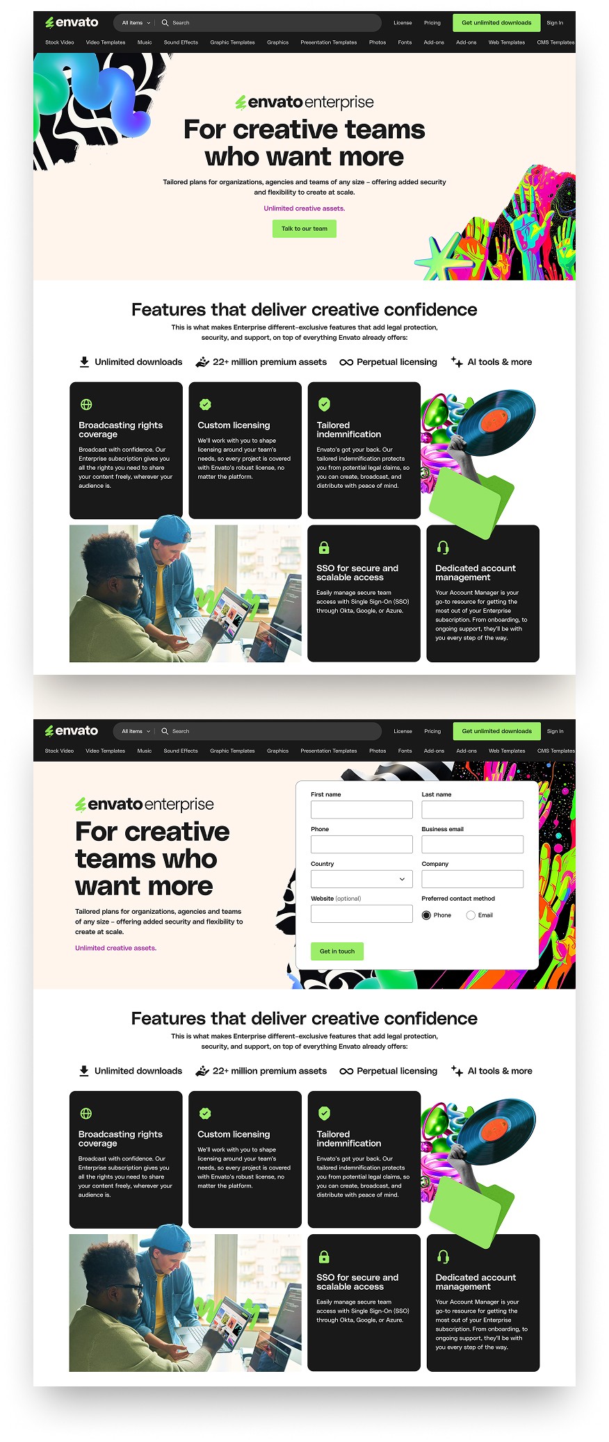
The Enterprise Landing Page at Envato had recently been updated to reflect the company’s new brand identity.
However, despite aligning visually, it wasn’t effectively positioning Enterprise as a premium solution for high-tier clients. The page suffered from excessive white space and lacked strong messaging, which led to a disjointed and underwhelming experience for potential customers.

Goals
The hypothesis behind this project was that a more refined visual design would help position the page as a premium experience, making the product’s value clearer and increasing the likelihood of conversion.
At the same time, careful use of space was essential to balance aesthetics with functionality, ensuring the page remained engaging, clear, and easy to navigate without overwhelming the user.
Experimentation
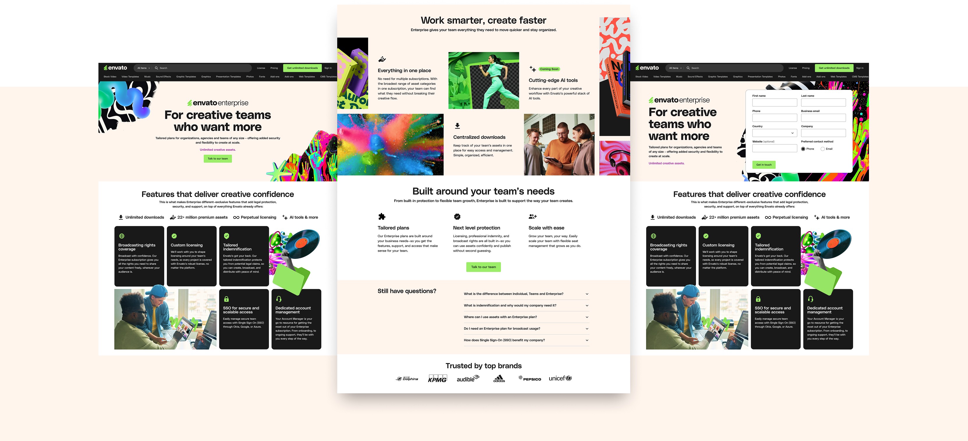
To validate the impact of form visibility on lead quality and volume, we launched an A/B test:
Version A: Form visible by default.
Version B: Form hidden until user interaction.
The experiment aimed to help us understand which version encouraged more qualified, high-intent users.
Outcome & Impact
The variant with the open form in the header produced a measurable increase in lead submissions compared to the control, confirming that reducing friction in the first interaction significantly improved conversion behavior.
A follow-up question from the marketing team was whether the higher volume of submissions translated into qualified enterprise leads or simply increased low-intent inquiries.
Post-experiment analysis showed that the proportion of qualified leads remained consistent with the previous baseline, indicating that the increase in volume did not dilute lead quality.
This experiment reinforced an important insight for enterprise-focused pages: reducing friction in the first contact interaction can increase lead generation without compromising lead quality, especially when the page already attracts high-intent visitors.
The result informed subsequent marketing experiments and helped validate a stronger conversion-first structure for enterprise landing pages.
Credits
Lead Product Design → Oliva Meg
Image & Visual Curation → Mel Findlay
Engineering → César Rivera
Other work


© 2026 Oliva Meg
Designed with Figma and Published with Framer