Case Study
Fotolife — A Photography Selling System
Product Design / Visual Identity

Context
Fotolife is a company focused on souvenir photography at tourist destinations, where visitors can purchase photos taken during specific attractions or experiences. As the company scaled, there was a need to rethink not only how photographs were sold on-site, but how the entire experience was presented across physical and digital touchpoints.
My collaboration began at an early stage of this transition. Part of the work involved establishing a rebranding that could support growth and scale — setting a clearer, more modern identity that would later extend into product interfaces. This rebranding effort was not treated as an isolated exercise, but as groundwork for a broader system that needed to live consistently across hardware, software, and web.
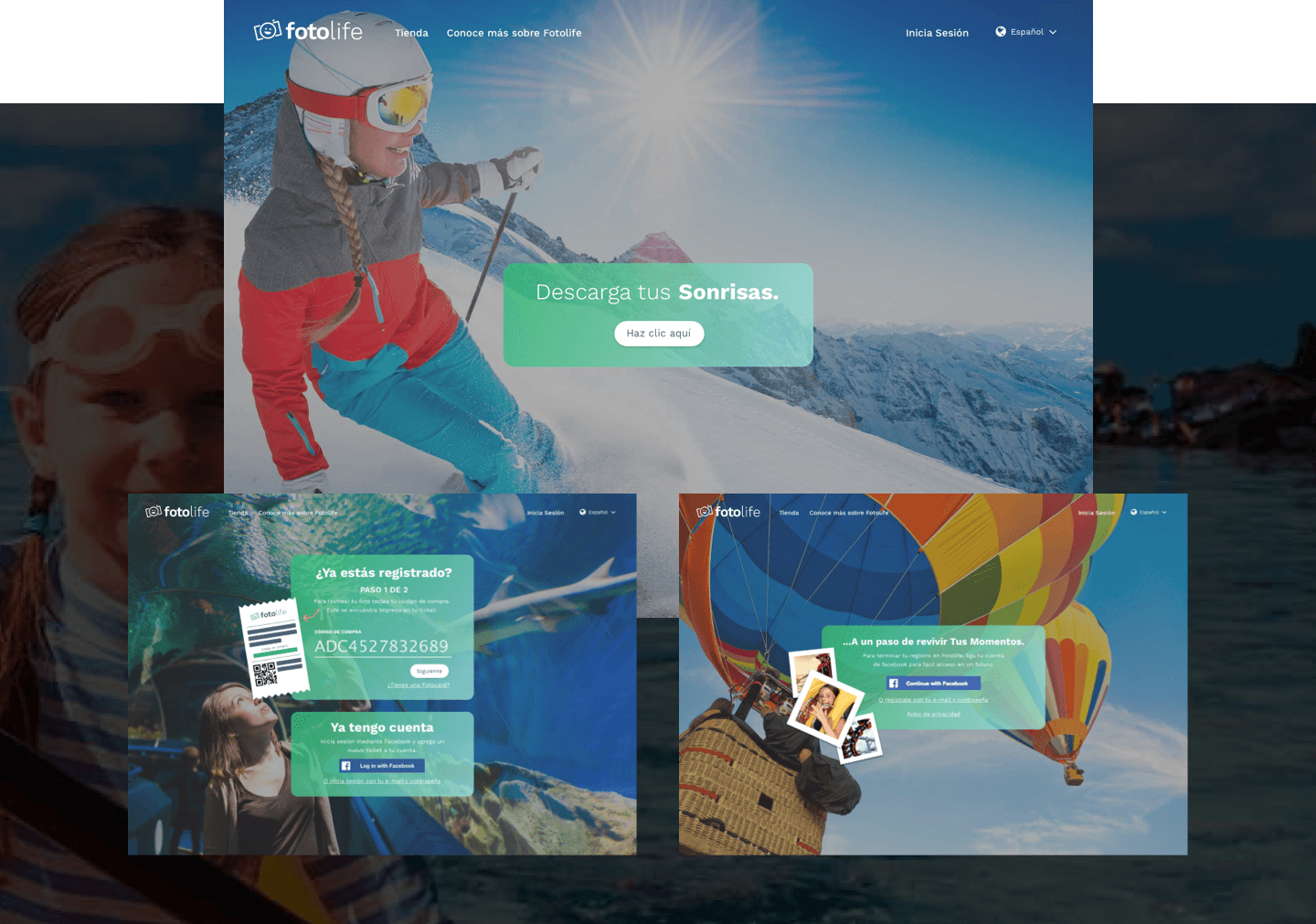
Following this foundation, I worked on the design of a tablet-based selling system that allowed visitors to browse, select, and purchase their photos independently. In parallel, I contributed to the website experience, which acted both as a digital access point for purchased content and as an entry point for potential business partners.

Challenge
The challenge was designing a system that could be understood instantly by first-time users, often interacting with it in fast-paced, public environments and without any staff assistance.
The experience needed to feel self-explanatory, resilient to interruption, and efficient enough to support a commercial flow without slowing users down, all within current system constraints.
Beyond usability, the system also had to align with a broader brand evolution. The interface needed to reflect a more premium, confident visual language while remaining flexible enough to scale across different touchpoints and future use cases.
Approach
Key decisions centered around simplifying choice. Photos were presented in a way that prioritized recognition first, followed by progressively revealing purchase options only when relevant.
This reduced visual noise and allowed users to move forward confidently without feeling rushed or overwhelmed. Touch interactions were designed to be forgiving and direct, accounting for varied user familiarity and real-world conditions.
At a system level, the visual language established during the rebranding phase informed the interface design. Colors, typography, and layout patterns were applied consistently to reinforce trust and coherence across touchpoints.
The goal was not only usability, but continuity — ensuring the experience felt unified whether users were interacting with a tablet on-site or accessing their content later through the website.

Outcome
For me, this work marked an early step toward designing systems rather than isolated interfaces. It taught me in my early career the importance of thinking across touchpoints, collaborating closely with engineering, and using design as a way to reduce complexity in real operational contexts — principles that continue to shape my approach today.
Credits
Product and Rebrand Design → Oliva Meg
Product Direction and Creator → Pablo Marin
Developer → Hector Vela
Other work


© 2026 Oliva Meg
Designed with Figma and Published with Framer